User Research
UI
UX
Branding
Odyssey Hotels
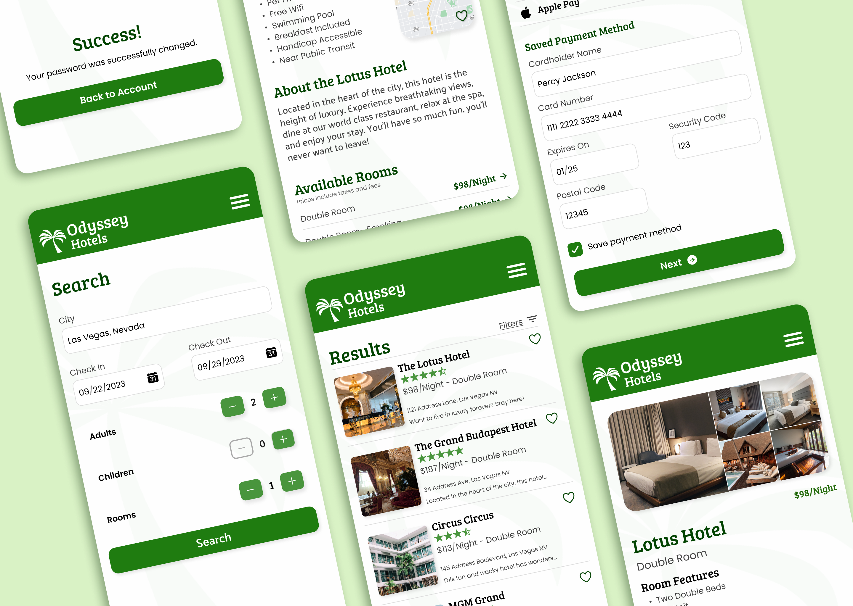
A hotel app designed to increase user trust during the booking process.

The problem
Odyssey Hotels needs to reverse declining sales. The issue isn’t usability, but a lack of confidence: users are completing the booking process, but they aren’t actually paying for hotel stays.

The solution
Design a hotel booking website that strategically leverages branding and UX design to increase user trust and booking confidence.
Research
How does a brand lose a user’s trust?
Through competitive analysis and user interviews, I identified three touchpoints that impacted user confidence:
Emotional Appeal & Brand Connection
How visual intrigue inspires user engagement
Brands that “felt like a getaway” significantly increased user interest and reinforced the desire to book.
Monochromatic greens and palm trees performed best during user testing.
Accuracy & Transparency
How upsells and sponsored results costs sales
Users expressed frustration with promoted-but-unrelated search results, surprise fees, and constant upsells on competitor sites. They preferred booking experiences that felt honest, accurate, and free of surprises.
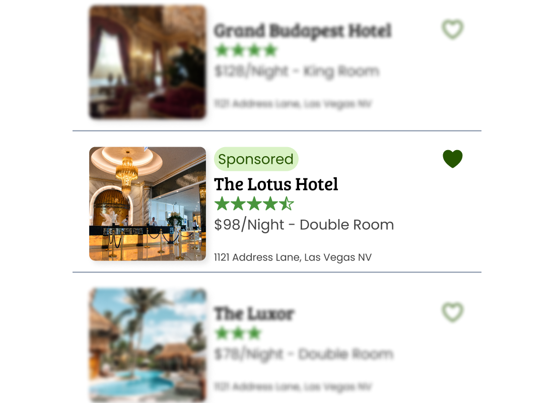
To help users know when content is sponsored, I added a sponsored label chip.
Friction & Clarity
How unclear information undermines user confidence
Ambiguous CTAs, unlabeled “mystery meat” icons, and confusing menus and flows made users feel uncertain and unprepared to book.
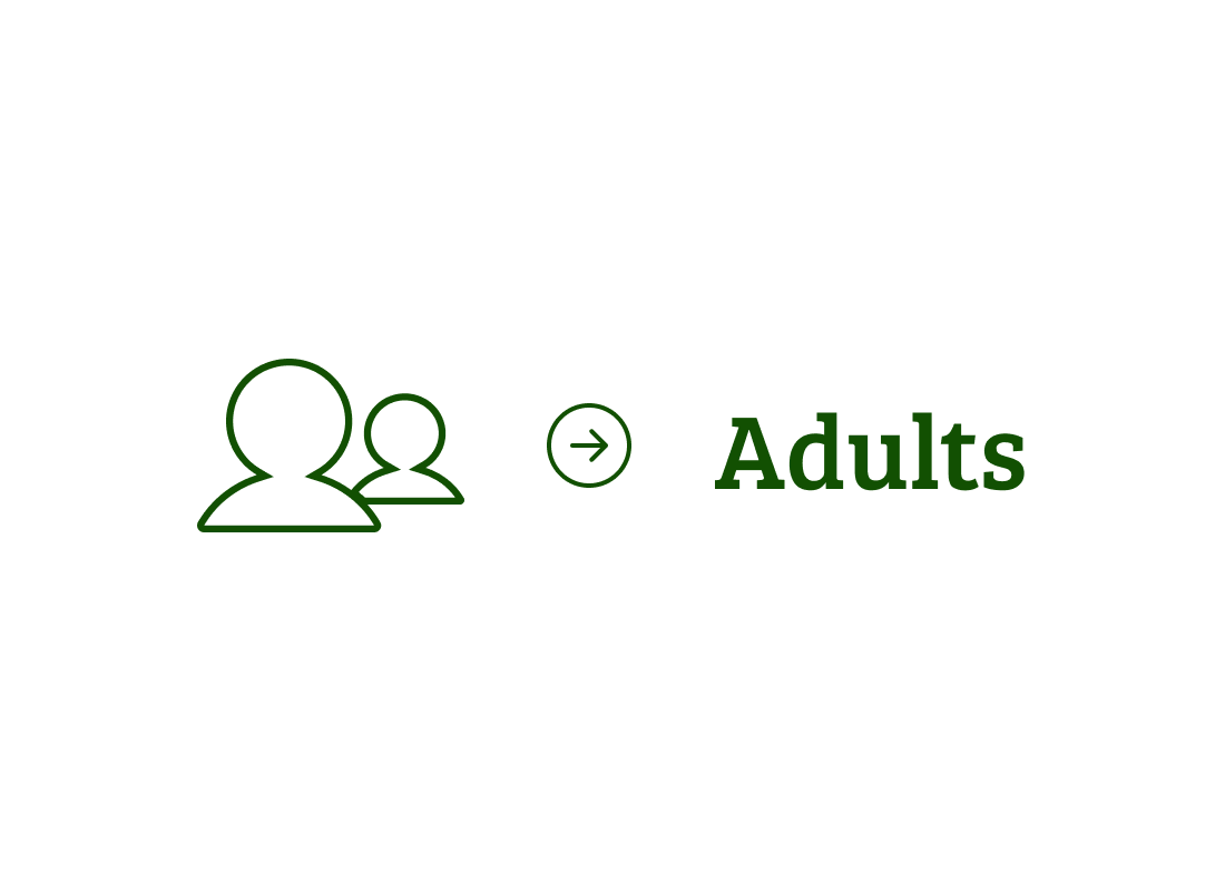
Users had trouble understanding that this icon from a competitor’s site meant “adults”, not “parent and child”.
Content Strategy
Building Trust into the Booking Flow
Based on those insights, I created a customer journey map to identify key opportunities to built trust along the booking process:

Finding a hotel booking platform
- Quality SEO to put Odyssey Hotels at the top of the results
- Crisp and modern thumbnails, icons & logos to draw users in
- Paid social media ads to meet users where they’re at
User Testing
Reducing friction by adopting user mental models
Users wanted to hop between the results, hotel, and room pages, but some users struggled to figure out how to move backwards in the flow. To improve clarity and reduce friction, I added a back button.
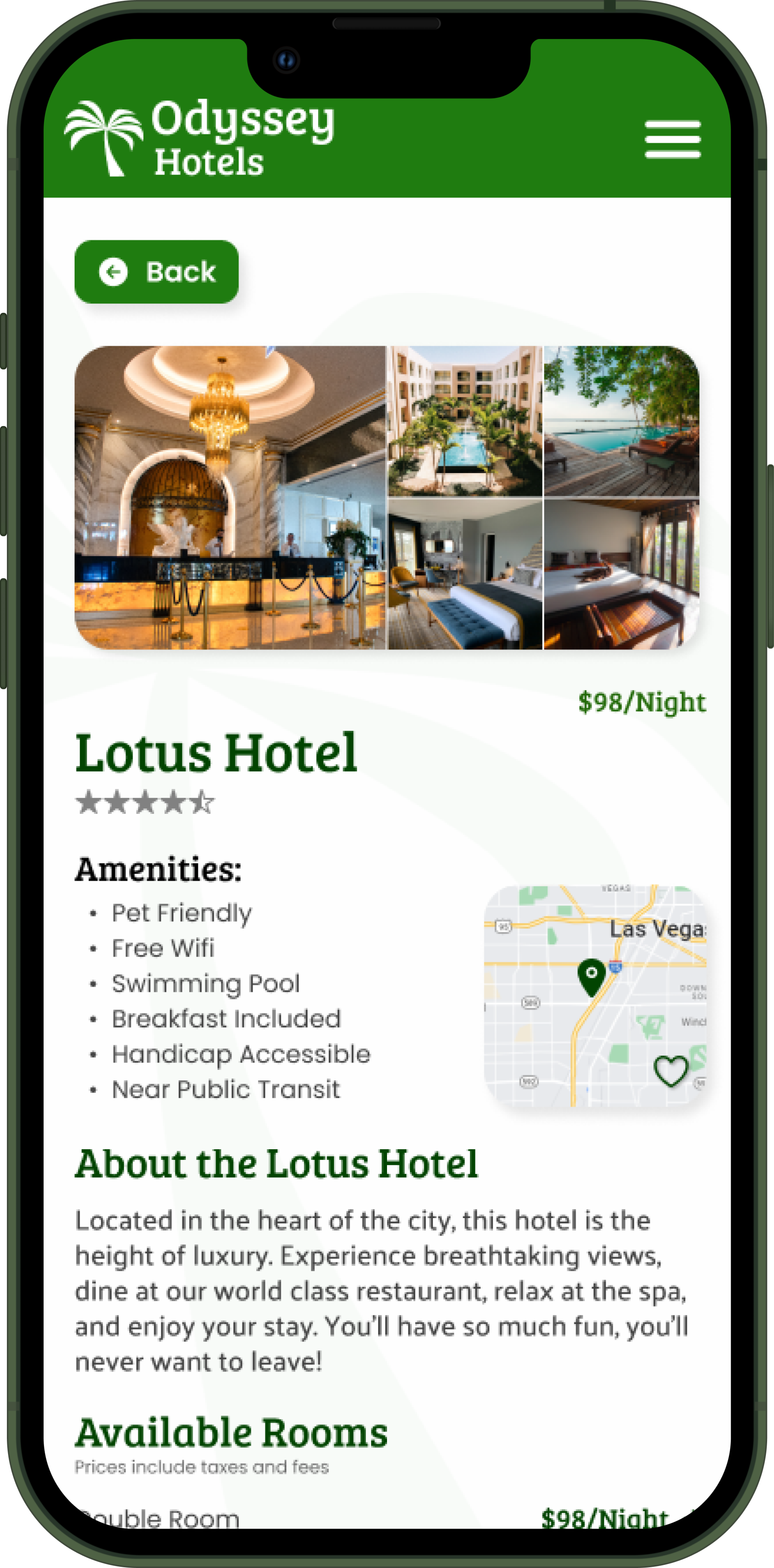
Users expected a back button near the top left of the screen, regardless of their phone’s built-in navigation.
Key Takeaways
What Odyssey Hotels taught me about user behavior
Good branding and UI is good UX.
Usable-but-ugly products are judged more harshly than pretty-but-clunky products, resulting in worse sales and user satisfaction scores even as other metrics, like flow completion rates, improve.
Users hate when products feel like cash-grabs.
Users are tired of ‘having ads crammed down their throats’, and react poorly to products that prioritize advertisers over users. By clearly labelling sponsored content and spreading ads across the user journey, designers can mitigate user frustration without compromising advertisement revenue.
Small moments of uncertainty add up.
Users who hesitated for even three seconds during the booking process were 75% less likely to book than users who did not hesitate. Performance errors, unclear navigation, and unstructured information discourage users from spending money and time on a product.
User Research
UI
UX
Branding
Odyssey Hotels
A hotel app designed to increase user trust during the booking process.
The problem
Odyssey Hotels needs to reverse declining sales. The issue isn’t usability, but a lack of confidence: users are completing the booking process, but they aren’t actually paying for hotel stays.
The solution
Design a hotel booking website that strategically leverages branding and UX design to increase user trust and booking confidence.
Research
How does a brand gain a user’s trust?
Through competitive analysis and user interviews, I identified three touchpoints that impacted user confidence:
Emotional Appeal & Brand Connection
How visual intrigue inspires user engagement
Brands that “felt like a getaway” significantly increased user interest and reinforced the desire to book.
Monochromatic greens and palm trees performed best during user testing.
Accuracy & Transparency
How upsells and sponsored results costs sales
Users expressed frustration with promoted-but-unrelated search results, surprise fees, and constant upsells on competitor sites. They preferred booking experiences that felt honest, accurate, and free of surprises.
To help users know when content is sponsored, I added a sponsored label chip.
Friction & Clarity
How unclear information undermines user confidence
Ambiguous CTAs, unlabeled “mystery meat” icons, and confusing menus and flows made users feel uncertain and unprepared to book.
Users had trouble understanding that this icon from a competitor’s site meant “adults”, not “parent and child”.
Content Strategy
Building Trust into the Booking Flow
Based on those insights, I created a customer journey map to identify key opportunities to built trust along the booking process:
Finding a hotel booking platform
- Quality SEO to put Odyssey Hotels at the top of the results
- Crisp and modern thumbnails, icons & logos to draw users in
- Paid social media ads to meet users where they’re at
User Testing
Reducing friction by adopting user mental models
Users wanted to hop between the results, hotel, and room pages, but some users struggled to figure out how to move backwards in the flow. To improve clarity and reduce friction, I added a back button.
Users expected a back button near the top left of the screen, regardless of their phone’s built-in navigation.
Key Takeaways
What Odyssey Hotels taught me about user behavior
Good branding and UI is good UX.
Usable-but-ugly products are judged more harshly than pretty-but-clunky products, resulting in worse sales and user satisfaction scores even as other metrics, like flow completion rates, improve.
Users hate when products feel like cash-grabs.
Users are tired of ‘having ads crammed down their throats’, and react poorly to products that prioritize advertisers over users. By clearly labelling sponsored content and spreading ads across the user journey, designers can mitigate user frustration without compromising advertisement revenue.
Small moments of uncertainty add up.
Users who hesitated for even three seconds during the booking process were 75% less likely to book than users who did not hesitate. Performance errors, unclear navigation, and unstructured information discourage users from spending money and time on a product.
User Research
UX
UI
Branding
Odyssey Hotels
A hotel app designed to increase user trust during the booking process.
The problem
Odyssey Hotels needs to reverse declining sales. The issue isn’t usability, but a lack of confidence: users are completing the booking process, but they aren’t actually paying for hotel stays.
The solution
Design a hotel booking website that strategically leverages research insights to increase user trust and booking confidence.
Research
How does a brand gain a user’s trust?
Through competitive analysis and user interviews, I identified three touchpoints that impacted user confidence:
Emotional Appeal & Brand Connection
How visual intrigue inspires user engagement
Brands that “felt like a getaway” significantly increased user interest and reinforced the desire to book.
Monochromatic greens and palm trees performed best during user testing.
Accuracy & Transparency
How upsells and sponsored results costs sales
Users expressed frustration with promoted-but-unrelated search results, surprise fees, and constant upsells on competitor sites. They preferred booking experiences that felt honest, accurate, and free of surprises.
To help users know when content is sponsored, I added a sponsored label chip.
Friction & Clarity
How unclear information undermines user confidence
Ambiguous CTAs, unlabeled “mystery meat” icons, and confusing menus and flows made users feel uncertain and unprepared to book.
Users had trouble understanding that this icon from a competitor’s site meant “adults”, not “parent and child”.
Content Strategy
Building trust into the booking flow
Based on those insights, I created a customer journey map to identify key opportunities to built trust along the booking process:
Finding a hotel booking platform
- Quality SEO to put Odyssey Hotels at the top of the results
- Crisp and modern thumbnails, icons & logos to draw users in
- Paid social media ads to meet users where they’re at
User Testing
Reducing friction by adopting user mental models
Users wanted to hop between the results, hotel, and room pages, but some users struggled to figure out how to move backwards in the flow. To improve clarity and reduce friction, I added a back button.
Users expected a back button near the top left of the screen, regardless of their phone’s built-in navigation.
Key Takeaways
What Odyssey Hotels taught me about user behavior
Good branding and UI is good UX.
Usable-but-ugly products are judged more harshly than pretty-but-clunky products, resulting in worse sales and user satisfaction scores even as other metrics, like flow completion rates, improve.
Users hate when products feel like cash-grabs.
Users are tired of ‘having ads crammed down their throats’, and react poorly to products that prioritize advertisers over users. By clearly labelling sponsored content and spreading ads across the user journey, designers can mitigate user frustration without compromising advertisement revenue.
Small moments of uncertainty add up.
Users who hesitated for even three seconds during the booking process were 75% less likely to book than users who did not hesitate. Performance errors, unclear navigation, and unstructured information discourage users from spending money and time on a product.